Color and Confidence: When Art Refuses to Sit Still
There’s something electric about a burst of color that just appears.
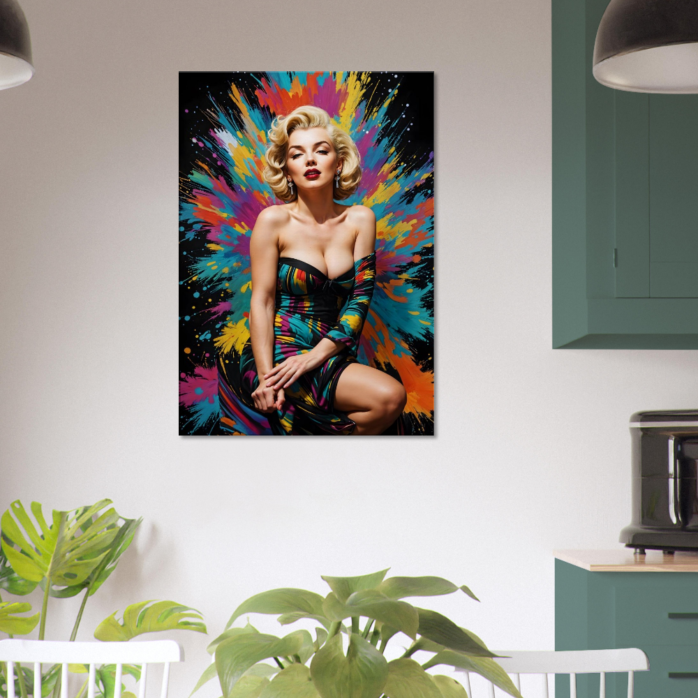
In the Colorburst Glam, Marilyn Monroe is not surrounded by glamour or shadow, but by an explosion of paint: wild streaks of turquoise, magenta, orange, and gold. It's as if the air itself has decided to celebrate her.
At first glance, it feels almost rebellious, this meeting of timeless icon and untamed abstraction. Yet the longer you look, the more it begins to make sense. Marilyn was never just beauty; she was motion, energy, and contradiction. Here, she seems to have stepped right out of the black-and-white world that tried to contain her.
The Joy of Controlled Chaos
There’s an honesty to color that black-and-white photography often hides.
This piece of art makes you want to look at it. It takes up space in our minds like creativity does, but we can learn to control it.
The background looks like a detonation of imagination, every hue crashing outward from the center as if inspired by her own confidence. You could almost believe the explosion happened because she breathed.
In interior spaces, that same effect can shift a room’s energy. The colors feel alive, even when the light is still. It’s the kind of art that seems to pulse quietly in the corner of your vision, reminding you that rooms, like people, are more interesting when they don’t try to behave.
A Canvas Built for Depth
On the technical side, the print has a texture that gives those colors a life beyond their surface. The cotton-polyester blend, dense at around 300 to 350 gsm, allows pigment to sink in softly, creating a surface that absorbs light rather than deflecting it.
Under a lamp or natural morning glow, the colors appear to shift slightly, as if the canvas is reinterpreting the moment. That’s the subtle beauty of the matte finish—no glare, no shine, just tone and texture working together like music and silence.
Each piece is stretched carefully over FSC-certified wood bars, about 2 centimeters thick, so it holds its form without dominating the wall. The structure feels discreet and confident—much like the subject herself.
But perhaps that’s too much about the material. The truth is, people don’t buy art for its specifications. They buy it for what it does to the air around them.
When Color Speaks Emotion
Art like this can be a mirror. If you're someone who's drawn to its chaos, it may remind you of your own creative restlessness—that urge to make, to imagine, to refuse the dull safety of sameness. For another, it might feel like permission: permission to be bold, or joyful, or even a little disobedient.
It’s tempting to see Marilyn here as a muse, but she’s more like an accomplice. The paint seems to be celebrating her refusal to stay still. The color doesn’t crown her; it erupts because of her.
Of course, some might see this image and think it’s too loud, too indulgent. But that’s what makes it interesting. It asks something of the viewer—to embrace color not as decoration but as emotion made visible.
For the Dreamers Who Decorate with Instinct
Imagine this piece hanging in a space that’s been a little too quiet—a neutral living room, perhaps, or a workspace waiting for a hint of risk. The splash of paint acts like conversation, like laughter breaking a polite silence.
There’s a certain courage in decorating with art like this. You’re not filling a space; you’re declaring something about yourself. You’re saying you value energy over caution, curiosity over order.
In homes where creativity lives—studios, offices, corners filled with half-read books—this print tends to feel at home. It’s the kind of piece you don’t match furniture to; you let it lead, and somehow the rest of the room follows.

The Conversation Between Art and Craft
It’s easy to forget that every artwork, even a printed one, is the product of both imagination and engineering. The canvas fibers, the saturated inks, and the sustainably sourced frame—all are small acts of design meant to preserve an artist’s idea in physical form.
But what makes this collection special isn’t just its quality; it’s the way that quality disappears into the experience. You don’t think about the GSM weight or the mounting kit once it’s on your wall. You think about the way the color seems to breathe at dusk, or how the expression on her face changes when you dim the lights.
That’s the quiet magic of a well-made canvas. It doesn’t just hang; it converses with light, with mood, with you.
What It Feels Like to Live with Boldness
There’s a theory that color can influence thought. Blue encourages focus. Yellow sparks optimism. Red demands presence. Whether that’s science or myth hardly matters—you feel it when you stand in front of this piece.
There’s something invigorating about its confidence. Not arrogance, exactly, but the kind of poise that comes from knowing you don’t need approval. The dress, painted in streaks of spectrum color, feels like a metaphor for a life lived fully—messy, radiant, never neutral.
And isn’t that what most of us secretly want our homes to express? Not perfection, but personality. Not harmony, but rhythm.
Gifting Energy, Not Objects
For those who buy art as gifts, this piece carries a particular kind of meaning. It isn’t sentimental; it’s kinetic. Giving it to someone creative—a writer, a designer, a dreamer—feels like offering permission to stay unapologetically themselves.
The colors almost seem to whisper: keep going, keep imagining.
Of course, not everyone wants encouragement in such vivid tones. Some prefer calm landscapes and soft abstracts. But art like this is for the person who never liked quiet for too long—the kind who needs a little chaos to think clearly.
Texture, Time, and the Pleasure of Looking
Over time, the texture of the canvas starts to feel familiar, like the grain of wood on a well-used table. You may find yourself noticing small details—the brush-like motion of color, the slight roughness where pigment meets fiber. These are things that printed posters never give you.
It’s the difference between image and object, between decoration and presence. A canvas isn’t simply seen; it’s lived with.
You might stop noticing it after a while, the way we stop noticing sunlight, until one day it catches you again. Maybe it’s the way morning light hits the surface, or how a guest pauses in front of it a little longer than expected. That’s how you know it’s working—quietly, persistently, as good art tends to do.
Let Color Take Up Space
Maybe the message hidden inside the Colorburst Glam is to not be afraid to stand out. This doesn't apply to conversation, art, or life.
Marilyn’s expression here carries that idea perfectly. Half serenity, half challenge. It’s as if she’s saying, beauty isn’t stillness—it’s motion.
Printed on durable, eco-certified canvas, built to last but designed to breathe, this artwork isn’t a decoration so much as an invitation. To live with more color. To risk a little brightness. To remember that sometimes, confidence begins with a spark.
Explore the full Marilyn Monroe Canvas Collection, where classic icons meet modern imagination—proof that art, like life, shines brightest when it refuses to stay quiet.


