
From Monochrome to Multicolor: How to Welcome Color Into Your Calm, Neutral Home
If you’ve ever wandered through a Pinterest board of Scandinavian interiors or peeked inside a minimalist friend’s living room, you probably know the serene beauty of an all-neutral space. Cool grays, creamy whites, soft taupe—it’s easy to see the appeal. Neutral decor is calming, reliable, and rarely risks “going out of style.” Still, there comes a point (at least for some of us) when monochrome starts to feel a bit... safe. Maybe even a little uninspired.
While it’s tempting to stick with what works, an increasing number of style lovers are quietly wondering what might happen if a burst of color walked in and shook things up. For anyone curious about stepping beyond beige—but hesitant about losing that signature minimalist peace—let’s explore some gentle, creative ways to add color, starting with the easiest upgrade of all: art.
Why Add Color? And Why Now?
It’s probably fair to say that not everyone is convinced color belongs in a minimalist home. The idea of clashing or “ruining the vibe” is a common worry. Yet, those who make the leap often report their spaces feel more personal, optimistic, and energetic. There’s even a growing body of research that links color to mood—though not everyone buys into the idea that, say, yellow automatically equals happiness or blue guarantees calm.
For many, the key seems to be balance: holding on to that tranquil foundation while layering in one or two thoughtfully chosen hues. Not every minimalist wants a riot of rainbows on their walls, and that’s perfectly valid. The best transformations, it appears, usually start small.
Art: The Safest Way to Test Your Palette
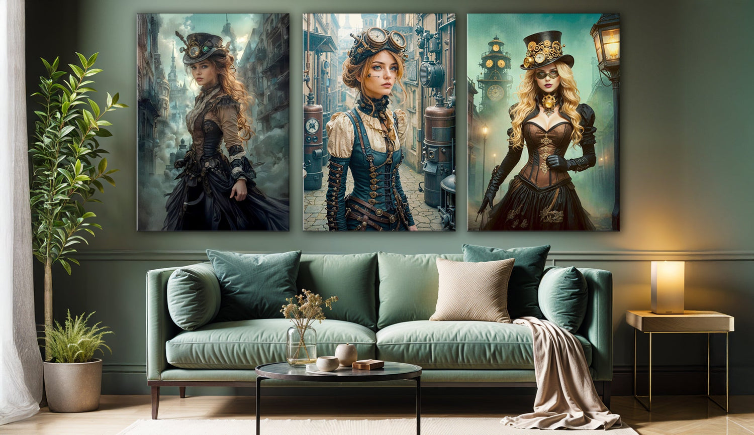
If there’s one design trick that rarely fails, it’s using art to introduce new tones. Acrylic wall art is especially suited for this—it’s vibrant, glossy, and, perhaps most importantly, temporary. You’re not painting the whole room or reupholstering your couch; you’re simply experimenting. If you tire of a color, swapping out a print is a breeze.
Many designers advise beginning with just one statement piece. Imagine a bold abstract print, shimmering in crystal-clear acrylic, catching the light above your neutral sofa. Or perhaps a landscape that blends natural tones with a pop of emerald or coral, providing a gentle bridge between beige and color.
There’s a lingering myth that only subtle artwork fits into a minimalist home, but some of the most striking interiors manage to balance simplicity with something a little bit daring. It’s less about crowding your space with color and more about letting one piece become the conversation starter.

Color Confidence: Easy Upgrades That Don’t Overwhelm
So what happens after you’ve tried that first pop of color? If you feel energized, you might consider layering in more—gradually. Here are a few ideas (though you probably have your own twist in mind):
- Create a Color Story: Instead of a mishmash, try picking two or three complementary colors from your chosen artwork and echoing them in a throw pillow or a vase. This can create cohesion without chaos.
- Mix With Neutrals: Even in a bold piece, the surrounding space stays peaceful. White walls, pale floors, and natural wood allow art to shine, never shouting over it.
- Go Modular: Try a set of smaller acrylic prints with different tones. Gallery walls don’t have to be busy; they can be surprisingly minimalist if you keep the spacing generous.
- Lean Into Nature: Botanical wall art with leafy greens or floral bursts often feels less “risky” than geometric neon. There’s something about nature themes that blends well with neutrals.
Critique: While some worry that color will instantly dominate, most people find the opposite—one bright piece tends to highlight the calm of everything else. Of course, not everyone loves contrast, and for some, sticking with monochrome feels just right. That’s the beauty of art: it’s always your call.
Where to Place Your First Pop of Color?
It’s tempting to tuck color away, but the impact is bigger when art is front and center. Try the spot above the living room sofa, your dining nook, or even the hallway you walk through every day. Bedrooms also benefit from a playful or calming print over the bed, and kitchens—so often overlooked—can come alive with a dash of blue, yellow, or coral above a countertop.
Acrylic wall art works especially well in high-traffic areas, since it’s easy to clean and hard to damage. Even if your space leans ultra-modern, frameless prints create a look that’s sleek, not cluttered.
Take the Leap Into Color (It’s Easier Than You Think)
Making any change in your home decor, especially in a space built on calm and quiet, takes a bit of courage. Yet, most people who experiment with colorful wall art describe feeling re-energized, not overwhelmed. In the end, color isn’t an enemy of minimalism; it can be its greatest ally, adding that extra note of personality you might not have known you were missing.
Ready to see what a single burst of color can do for your home? Our curated collection of acrylic wall art was created for interiors just like yours—quiet, calming, but never boring. Take the leap and let color find its way in. Your home will thank you.


