
Moody Luxe: Designing with Black and Gold Prints That Speak in Shadows and Shine
Some spaces aren’t meant to feel “bright.” They’re meant to feel intentional. They hold you the way a velvet armchair does—soft yet strong, rich without being loud. And in those rooms, color isn’t just color. It’s mood. Its meaning. It’s black and gold.
If you’ve been circling the idea of deep luxury—the kind that whispers, not shouts—you might find yourself drawn to Golden Noir art. While the phrase alone sounds cinematic, the aesthetic carries real design weight. Paired with the right textures and tones, it doesn’t just decorate—it curates.
Let’s explore how this blend of darkness and shimmer can elevate your home—and how the Golden Noir 2025 wall calendar might be a surprisingly perfect entry point.
Gold Doesn’t Scream—It Glows
It’s tempting to assume gold is flashy. In some settings, it is. But when layered against matte black, deep navy, or warm walnut, gold becomes something else entirely. It feels timeless—less about sparkle, more about soul.
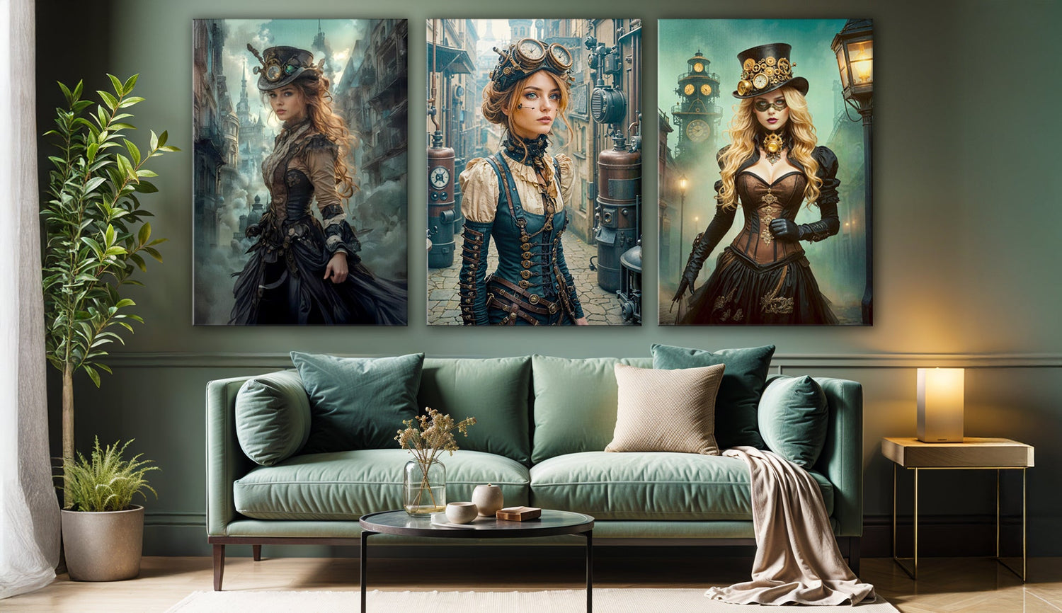
The Golden Noir aesthetic leans into this tension. Think of a luminous outline of a woman traced in soft light or the suggestion of a forest gilded with midnight mist. These calendar artworks don’t simply hang—they seem to hover, playing with shadow and depth. Depending on the surrounding textures, they can either lean into mystery or offer just the right hint of glam.

Palette Pairings: Velvet, Marble, and Metal
Designing with black and gold is less about matching and more about contrasting with intention. Here are a few moody-luxe combinations that seem to invite the Golden Noir prints into the conversation:
- Velvet + Black Frame: When paired with a plush olive or aubergine velvet backdrop, black frames fade, allowing gold detailing to float forward.
- Brushed Brass + Marble: Placing one of these calendar prints beside a white-veined black marble surface, layered with brushed brass elements, introduces cohesion without overstatement.
- Charcoal Linen + Candleglow: Consider how the golden tones might shift under dim lighting. These pieces thrive in ambient setups, particularly when balanced with soft upholstery or vintage-inspired lighting.
Critically, though, these pairings don’t work in every setting. Too much sheen, and the mood risks becoming heavy-handed. Too little, and the artwork might feel misplaced. The key lies in layering—not decorating. Curating.
From Calendar to Gallery
Unlike single-purchase art prints, the Golden Noir wall calendar 2025 offers 12 unique pieces across the year. That means twelve opportunities to rotate your visual environment—to evolve your space along with the seasons or your mood.
At 11"x16.5”, each page has enough presence to hold its own in a frame or shadow box. The paper itself is no afterthought either—printed on 250 gsm coated silk paper, it feels more like a high-end print than a functional planner. Even the packaging is refined, arriving professionally wrapped and ready for display.
Given that the full calendar costs $29.99, it could be argued that you're paying less than $2.50 per artwork. And for interiors that crave both minimal waste and maximum effect, that’s not a bad deal.
Design Meets Ethics
Of course, aesthetics aren’t the only concern for today’s decorators. Sustainability matters too—and for good reason. The 2025 Golden Noir calendar is produced using FSC- and PESC-certified papers, printed on demand, and shipped with low-waste packaging. It’s likely not a zero-impact item (few things are), but it tries—thoughtfully—to tread lightly.
Some might argue that the true luxury is mindful production. And while not every buyer will prioritize that balance, it’s becoming an increasingly important part of the conversation between form and function.
Who’s This For?
- Interior designers are looking for art that transitions easily between staging and permanence.
- Homeowners who love dramatic palettes but want artwork that doesn't overpower.
- Renters hoping to build a gallery wall with depth, minus the long-term commitment or budget strain.
- Professionals seeking a calendar that functions practically in the home office but delivers emotional atmosphere, not sterile planning.
It may not work in brightly colored, eclectic spaces—and that’s okay. Golden Noir thrives in tension, not chaos. It complements quietude. It amplifies calm.
A Note on Layered Living
Living with black and gold isn’t about following trends. It’s about shaping experience. It’s about walking into your home and feeling a shift—not just in lighting or temperature, but in tone.
Each time you change a page of the monthly calendar 2025, you’re adjusting that tone. You're not just marking time. You’re re-curating presence.
One Last Look Before You Style
If your space leans toward the deliberate, the moody, and the tactile—Golden Noir might speak your language. And if you're not ready to commit to large-scale investment pieces, this full year wall calendar 2025 gives you a way in. One page at a time.
Curate ambiance. Not just décor.


