
The Poetry of Shadow and Gold: Three Prints That Redefine a Room
Walk into a room where nothing on the walls speaks, and the silence can feel almost clinical. Yet hang the right trio of works, and the silence shifts—it becomes charged, suggestive, as though the walls themselves are keeping secrets. The Black & Gold Noir Acrylic Wall Art Set creates exactly that kind of atmosphere.
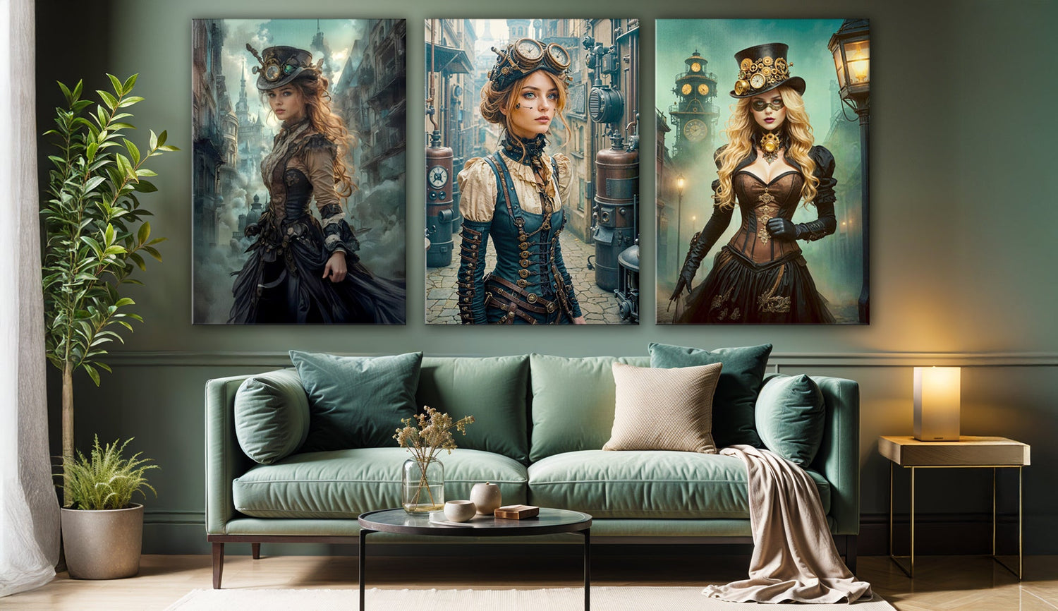
One piece shows a guardian wearing a cloak made of golden branches. Another piece shows a guardian surrounded by butterflies shining in the dark. The third piece shows a guardian surrounded by a group of metallic orbs and small decorations. This collection is more like an invitation to see things in a different way.
Black and Gold as a Language
Many interior designers do not recommend using black in home interiors. They argue that black makes spaces feel smaller and less bright. Gold, on the other hand, is sometimes dismissed as excessive, almost gaudy, when overdone. Yet the tension between the two can result in something startlingly elegant.
- Guardian of the Golden Forest wraps a figure in a swirling mantle of metallic leaves, as though nature itself were in motion around her. There’s both power and vulnerability here, depending on how long you linger.
- Golden Veil draws you into a gaze framed by butterflies. Some people might think it's too dramatic, even overly detailed, but the intricate details have a calming effect that makes it worth watching more than once.
- Golden Goddess is covered in decorations, and her portrait is filled with spirals, spheres, and crystal shapes. For some, it may seem almost overwhelming, but that excess carries its own beauty: abundance as an art form.
Together, they form not a tidy narrative but a set of contrasts—nature, metamorphosis, ornament—each piece complicating the others.

Acrylic as Medium and Mirror
There are viewers who prefer the texture of canvas, finding it warmer and more organic. Acrylic, with its reflective clarity, can feel distant and too sleek. Yet for black-and-gold compositions, the material seems almost necessary. The high-gloss surface amplifies the richness of shadows and turns the metallic details into liquid light.
As sunlight moves across the room, highlights flare and then recede. Under evening lamps, the gold softens, glowing rather than glittering. In effect, these works shift with the day, refusing to stay static. That quality makes them more than wall art for living rooms or bedroom decor—they become part of the changing rhythm of the space itself.
How to Arrange Them Without Losing Their Voice
The standard horizontal alignment, hung neatly over a sofa, certainly works. Yet with prints that carry this much personality, it risks dulling the impact.
Consider placing the Golden Goddess at the center of a feature wall, the most ornate of the three anchoring the collection. The Golden Veil could face her across a smaller wall, creating a quiet dialogue, while the Guardian of the Golden Forest is allowed height, slightly above eye level, to give the impression of protection or watchfulness.
Alternatively, a vertical stack can be surprisingly effective in narrow entryways, leading the eye upward as though one were ascending into the imagery itself. In more eclectic homes, separating the pieces across different rooms can be equally striking: each work stands on its own yet remains connected by palette and tone.
A Collector’s Hesitation
One homeowner I spoke with hesitated before choosing black-and-gold wall prints for her modern apartment. She feared they might clash with her neutral furniture or, worse, make the space feel too theatrical. Yet after hanging a set, she noticed the opposite: the gold reflected and warmed her minimalist surroundings, while the black gave them structure. What had once felt unfinished began to feel deliberate.
Her reaction wasn’t unique. The strongest art doesn’t only blend with decor; it transforms it. Sometimes that transformation is subtle, sometimes it borders on dramatic, but it rarely leaves a room unchanged.
Where They Belong
While these works thrive as living room wall decor, they are not limited to it. In a home office, they can introduce gravitas, the black absorbing distraction while the gold sharpens focus. In a bedroom, their reflective qualities take on a softer mood, catching low lamplight in ways that feel more intimate than imposing.
Even less obvious settings can benefit. Acrylic withstands moisture, making them possible candidates for bathroom wall art, where their reflective brilliance complements mirrors and fixtures. In dining rooms, they spark conversation, and in entryways, they act as first impressions, shaping how guests feel before a single word is spoken.
The Resonance of Shadow and Light
Gold is often linked with celebration, with memory, and with the brightness of fleeting moments. Black, conversely, provides silence, pause, and a background that allows brilliance to exist. When the two meet, the result is rarely neutral. It might feel dramatic, unsettling, or even indulgent—but isn’t that, in many ways, the point of bringing art into the home?
This trio doesn’t aim to soothe. It aims to resonate, to hold your attention a beat longer than you intended.
Closing Reflection
Not every space requires art this bold. For some homes, muted landscapes or minimalist patterns are enough. But if you’ve ever stood before a wall and felt it was waiting for something—something that carries weight and light in equal measure—then the Black & Gold Noir Acrylic Wall Art Set may be what fills that silence.
They are not simply prints on acrylic. They are presence, crystallized.


