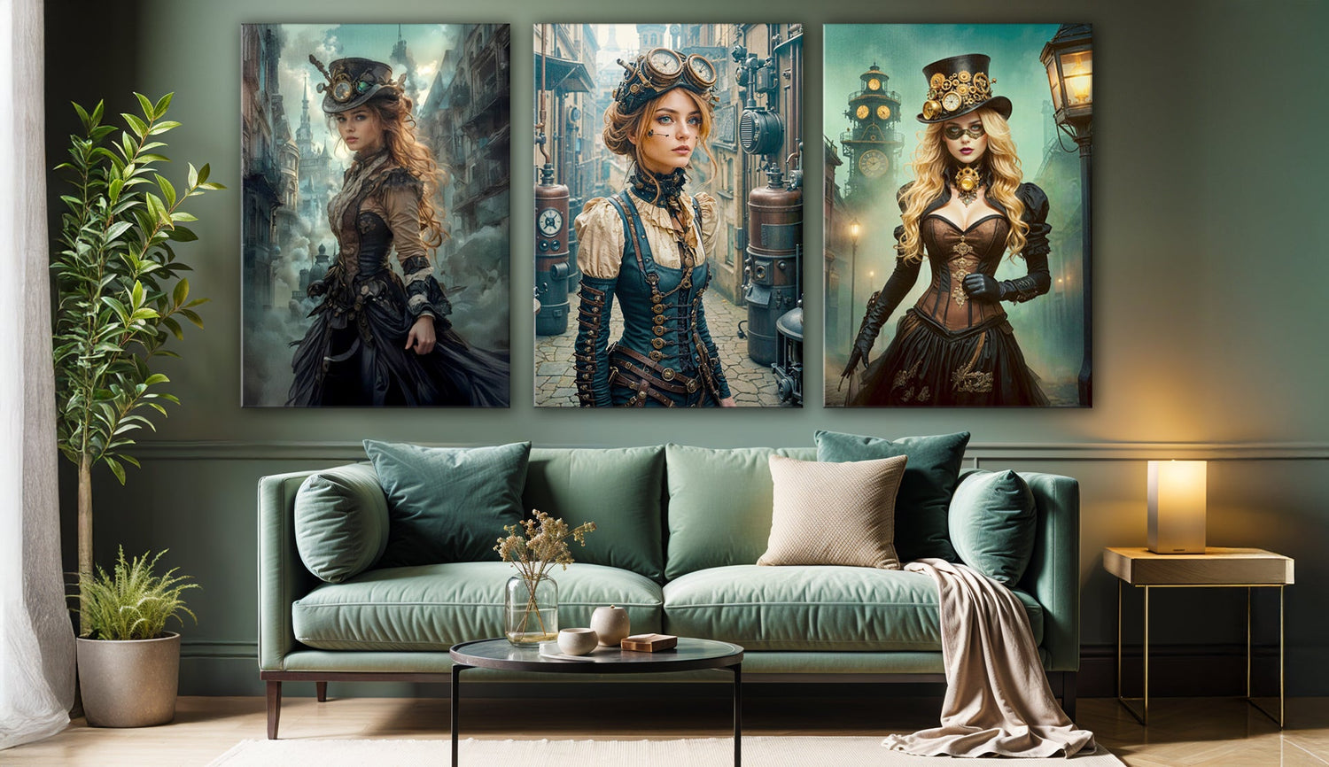

When Shadow Meets Gold: A Trio That Changes the Room
Step into a space that feels finished, and you usually notice not the furniture or the rugs, but the walls. They hold silence until something interrupts it—an image, a shimmer, a mood that spreads across the room. The Black & Gold Noir Acrylic Print Set interrupts silence with three different voices: a peacock bathed in radiance, a woman crowned with metallic adornments, and another whose face is fractured by gold.
At first glance, they could belong to separate stories. Yet when hung together, they begin to lean toward one another like characters who, by chance, found themselves in the same play.
The Tension Between Black and Gold
It has long been argued that black risks making a space too heavy, while gold leans toward indulgence. Combined, though, they often create something less predictable. Black draws the eye inward, creating depth, while gold scatters light across that darkness. The result isn’t always comfortable, but comfort isn’t the only purpose of wall art.
- In Golden Majesty, the peacock stands beneath a tree that seems to catch light from a hidden sun. The scene balances on the line between myth and dream, the kind of image that some might find theatrical yet others might find transporting.
- Gold Woman feels more sculptural, her elaborate adornments less like jewelry than extensions of architecture. The portrait speaks of stillness and restraint, yet the richness of detail makes it anything but quiet.
- Black & Gold Woman disrupts beauty with texture, her skin carrying cracks of molten gold. There’s unease in this image, an acknowledgement that perfection is rarely whole.
Placed as a set, these works don’t resolve into a single narrative. They leave a tension, and in that tension lies their power.
Acrylic as an Experience, Not Just a Surface
Some collectors remain hesitant about acrylic, arguing it can appear overly polished, even sterile. Yet in this case, the medium might be what allows the artwork to breathe. The high-gloss finish deepens shadows until they appear almost velvet, while the metallic tones take on a wet, liquid intensity.
In daylight, reflections catch in unexpected places, so the art shifts as the sun moves. By night, under soft lamps, the gold seems to hover, giving the illusion of light where none exists. Unlike canvas, which tends to settle into stillness, acrylic seems to keep performing, hour after hour. For modern living room decor, this fluid quality can be especially welcome, since a space often changes character from morning to evening.
Thinking Beyond the Predictable Layout
It’s tempting to hang three prints neatly in a row, particularly above a sofa. While this works, it can feel conventional, almost like a catalog image. With a set that carries this much personality, other arrangements might be more rewarding.
One possibility is to center the peacock on its own wall while placing the portraits opposite each other in a smaller alcove. The viewer experiences the animal first, then encounters human faces in dialogue. Another approach could be to stagger the prints in a diagonal, so the eye travels upward as though following a line of movement. In homes with high ceilings, a vertical stack transforms the set into something almost monumental.

The question is less about rules than about rhythm—how do you want the art to guide the eye, and what kind of energy should it leave in its wake?
A Story From a Collector
A client once confessed her walls had always felt “undecided.” She had filled shelves with books and objects, invested in good lighting, and even splurged on a rug that tied everything together. But the walls remained bare, as though the room were waiting for its final gesture.
When she tried a dark-toned trio of black and gold, she admitted she hesitated at first. Wouldn’t it overpower her modest apartment? Yet once hung, she noticed something unexpected: instead of shrinking the space, the art gave it clarity. Friends remarked less on her furniture and more on the sense of atmosphere. The gold reflected light; the black gave it weight. The room, at last, felt resolved.
Her story is hardly universal—bold palettes aren’t for everyone—but it illustrates how art has the ability not only to decorate but also to anchor.
Where They Might Live
These prints carry a mood that fits in many environments but thrives best where drama is welcome. In a living room, they establish a focal point that feels deliberate rather than accidental. In a home office, they introduce authority, as if the walls themselves are aware of their importance. In a bedroom, the reflective surfaces soften under low light, creating intimacy rather than spectacle.
The peacock piece, with its natural motifs, could also enrich a dining room wall, offering guests a visual counterpart to conversation. And because acrylic withstands humidity, even unexpected settings—such as a bathroom where mirrors already play with reflection—can become unexpected galleries.
Gold as Memory, Black as Pause
Gold carries associations of celebration and memory: it gleams like candlelight, and it recalls moments of joy. Black, by contrast, offers pause, a silence against which brightness becomes visible. Together, they act less as colors than as emotional language.
This may be why the trio feels so resonant. It doesn’t simply fill space. It shifts the emotional balance of a room, offering both spectacle and silence.
Closing Reflection
There are homes that thrive on neutrality, and for them, these works might indeed be too commanding. But for those willing to invite drama into their spaces, the Black & Gold Noir Acrylic Set offers something rare: not resolution, but resonance.
It doesn’t tell one story. It suggests many. And in the gaps between those suggestions, viewers find their own.


