
How to Curate a Noir Gallery Wall (Without Overthinking It)
There’s something oddly addictive about a perfectly curated gallery wall. You’ve probably seen them—those mesmerizing layouts where every print seems to breathe in rhythm with the next, yet nothing feels too polished or forced. The best ones? They don’t look like they came from a kit. They feel collected, considered… lived in.
And when you add in black and gold—the color palette of drama, elegance, and a little rebellion—the stakes rise. But so does the payoff.
If you’ve been eyeing the Black & Gold Noir acrylic print collection and wondering how to build a wall worthy of that glow, you’re in the right place. Let’s break down how to pull off a striking, gallery-style arrangement—even if you’re working with rental walls and zero design experience.
Start with Emotion, Not Just Aesthetics
Before getting into the layout logistics, take a moment to ask, “What feeling do I want to create?”
Are you going for bold glamour? A quiet, moody atmosphere? Maybe something surreal and story-rich, like a dreamscape?
A piece like “Guardian of the Golden Forest” carries myth and magic, while “Abstraction Gold Woman” pulses with energy. Pairing them is possible—but only if you’re clear on the mood you're curating.
Tip: Start with three words. For example—mysterious, radiant, modern. Use those as your compass.
The Rule of 3s, 5s, and Odd Numbers
While there’s no universal rule for gallery walls, odd numbers almost always look more organic. Why? They disrupt symmetry just enough to feel human.
- 3 pieces = The editorial look. Great for narrow walls or over furniture.
- 5 pieces = Balanced but lively. A go-to format for living room wall decor or dining room walls.
- 7 or more = Full gallery effect. Ideal for long hallways or that one big blank wall you never know how to fill.
Bonus: Choose one “anchor” piece—like “Black & Gold Woman”—and build around it with smaller, supporting prints like “Golden Flowers” or “Golden Cat.”
Spacing & Sizing: The Silent Architect
Even the most stunning acrylic wall art will lose impact if it’s hung too far apart or off-center. Here’s what works:
- 2"–3" of space between each piece is usually the sweet spot.
- Align artwork either by top edges (for a structured look) or centers (for a more dynamic, floating effect).
- If mixing sizes, cluster similar tones or themes. Let “Flower Hat” echo the softness of “Golden Veil,” while “Peacock on a Tree” balances “Golden Tree.”
And don’t feel pressured to cover the whole wall. Sometimes a well-placed trio leaves more impact than a dozen mismatched prints.
Why Acrylic Prints Just Work for Noir Walls
Let’s be honest—black and gold can be hard to get right in print. They either look flat or, even worse, muddy. That’s where acrylic printing shines—literally.
- The 4mm (0.15") thick acrylic gives the artwork a glass-like clarity and depth that paper or canvas can’t match.
- With vibrant, high-resolution detail, metallic tones pop and shadows stay rich.
- Every print includes drilled corner holes, clean straight-cut edges, and brushed hardware for that polished, floating appearance.
- Durable and scratch-resistant, acrylic makes these pieces ideal even for high-traffic zones like kitchens, entryways, or modern home offices.
Whether you’re building a full wall decor living room modern setup or styling a single panel in your bedroom, the material adds that little something extra.
Placement: Not Just Where, But How
A few practical thoughts:
- Above the sofa? Center your layout about 6–8 inches above the backrest.
- Over a bed? Keep the entire gallery wall below the midpoint of the wall for intimacy.
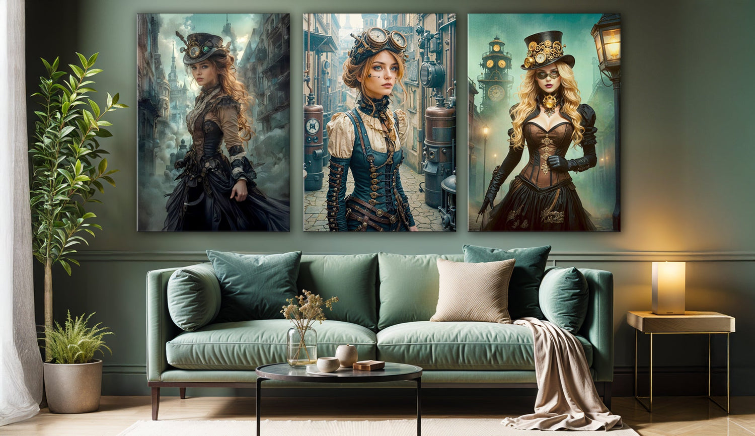
- In a hallway? Go vertical. Stack three same-size prints—try “Black Girl in Liquid,” “Gold Woman,” and “Steampunk Girl” in a line.
- Small space? Use mirrors or minimal sconces to frame the wall instead of more prints. Let the artwork breathe.

Don’t Fear the Mix
Let yourself play with contrasts: asymmetry against clean architecture, sensual portraits next to structured florals, and fantasy beside abstraction. It’s that friction that creates a feeling—not just a look.
And if you’re unsure, remember: nothing’s permanent. Acrylic prints are light enough to rearrange easily and strong enough to endure a few trial runs.
Make Your Walls Feel Like You
At the end of the day, a gallery wall is more than a design trend—it’s a story told in fragments. And when those fragments glow in black and gold, that story feels timeless.
Whether you live in a sprawling loft or a rented studio, you deserve walls that reflect your taste, your energy, and your sense of style.
No rules. Just rhythm, light, and the beauty of contrast.


